Thread Replies & Communities Redesign
Designed the first threaded reply system for Gainsight Customer Communities, transforming flat comment feeds into structured discussions. A contractual requirement in enterprise deals and a direct factor in lost contracts.
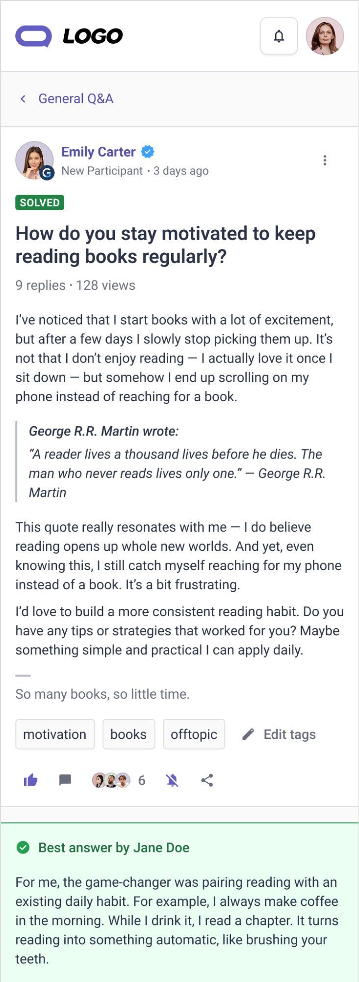
No enterprise competitor had designed for mobile first. That gap became our strategic differentiator.
I started by auditing six competing platforms: Reddit, Discourse, Khoros, Higher Logic, Vanilla Forums, and Salesforce Communities. Each made different tradeoffs, Reddit's unlimited nesting creates depth but loses casual users, Discourse's two-level model is clean but constrains conversation depth, and the enterprise options carry years of legacy UI debt.
The audit exposed one consistent gap: none had prioritised mobile. Most were desktop products retrofitted to smaller screens. That became our strategic differentiator, design mobile-first from the start rather than bolt it on later.
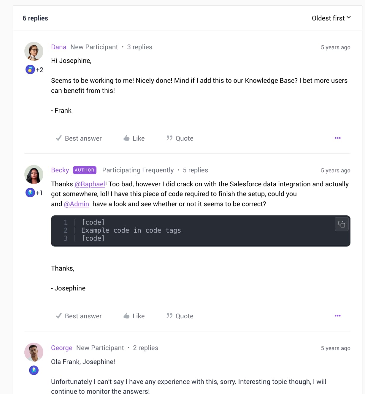
The core problem was not missing threading, it was discoverability. Both user groups could not find the conversations that mattered to them.
I ran structured research with two distinct groups: community members and community managers. The most significant finding was not about threading at all, it was discoverability. Community members could not find replies to their own posts. Community managers could not identify which conversations needed moderation. The flat feed buried signal in noise for everyone.
Mobile told a separate story. A significant portion of access was happening on mobile, but the experience had never been designed for it, users would read but rarely reply, and when they did, the broken composition experience led to incomplete posts and abandoned threads.
Clients had been waiting for this feature for so long that enthusiasm was high, but the validation sessions still surfaced two critical gaps we had not anticipated.
Given how UI-heavy threading is, we needed real client feedback before committing to a design direction. I used Figma Make to generate interactive prototypes quickly, functional enough to test core interactions without implying final decisions. We explored different nesting levels, action discoverability, and overall thread readability across three validation rounds.
Two gaps surfaced that directly changed the design: clients needed a quick way to mark a reply as the best answer inline, and the reply affordance on the root post was not obvious enough. Both were fixed before we committed to the final direction.
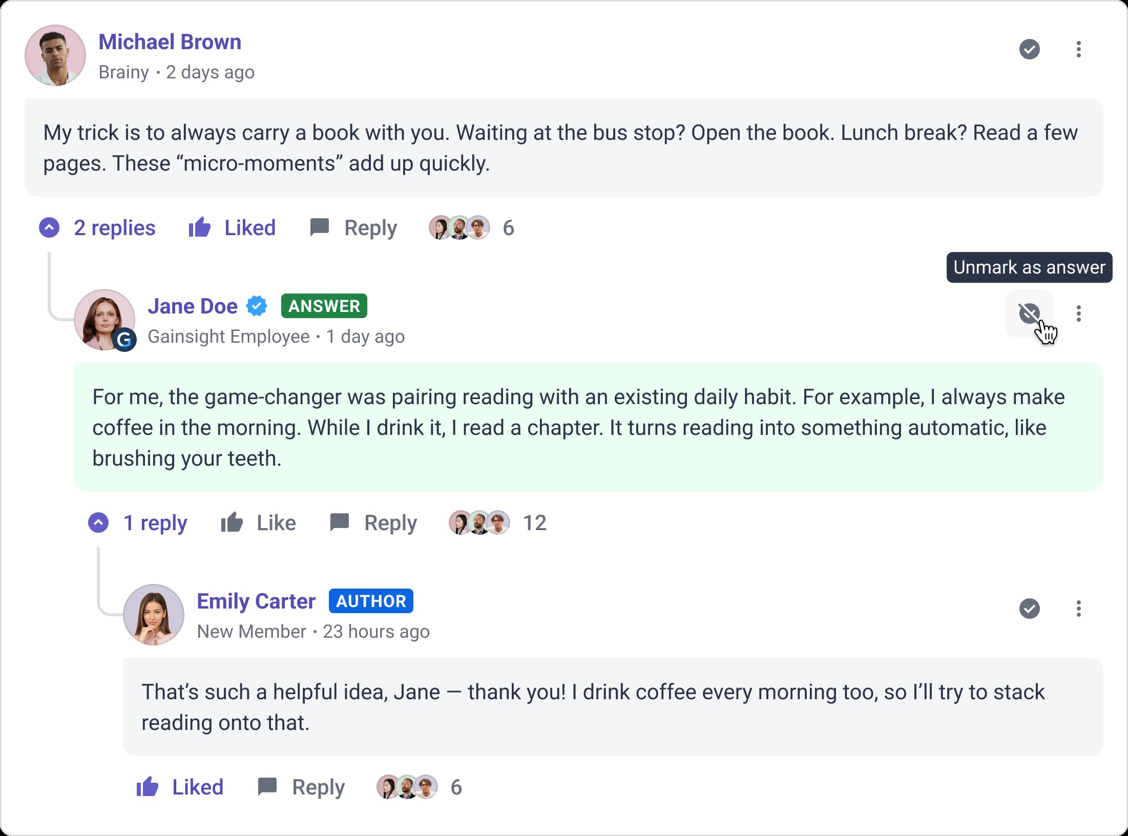
Mobile was the hardest constraint and the most valuable one. If an interaction felt wrong on mobile, it was usually wrong on desktop too, just harder to notice.
We explored three structural directions: deep Reddit-style nesting, flat two-level threading, and a bounded model with contextual expansion. The bounded model won because it treated the thread as a unit of content, root post, direct replies, replies to replies, no further recursion. That finite structure made everything downstream cleaner.
Mobile was the hardest design problem. With a full action set in a constrained space, we had to be ruthless about what was primary. We stripped all non-essential labels and moved secondary actions into contextual menus. That discipline made the desktop design better too.
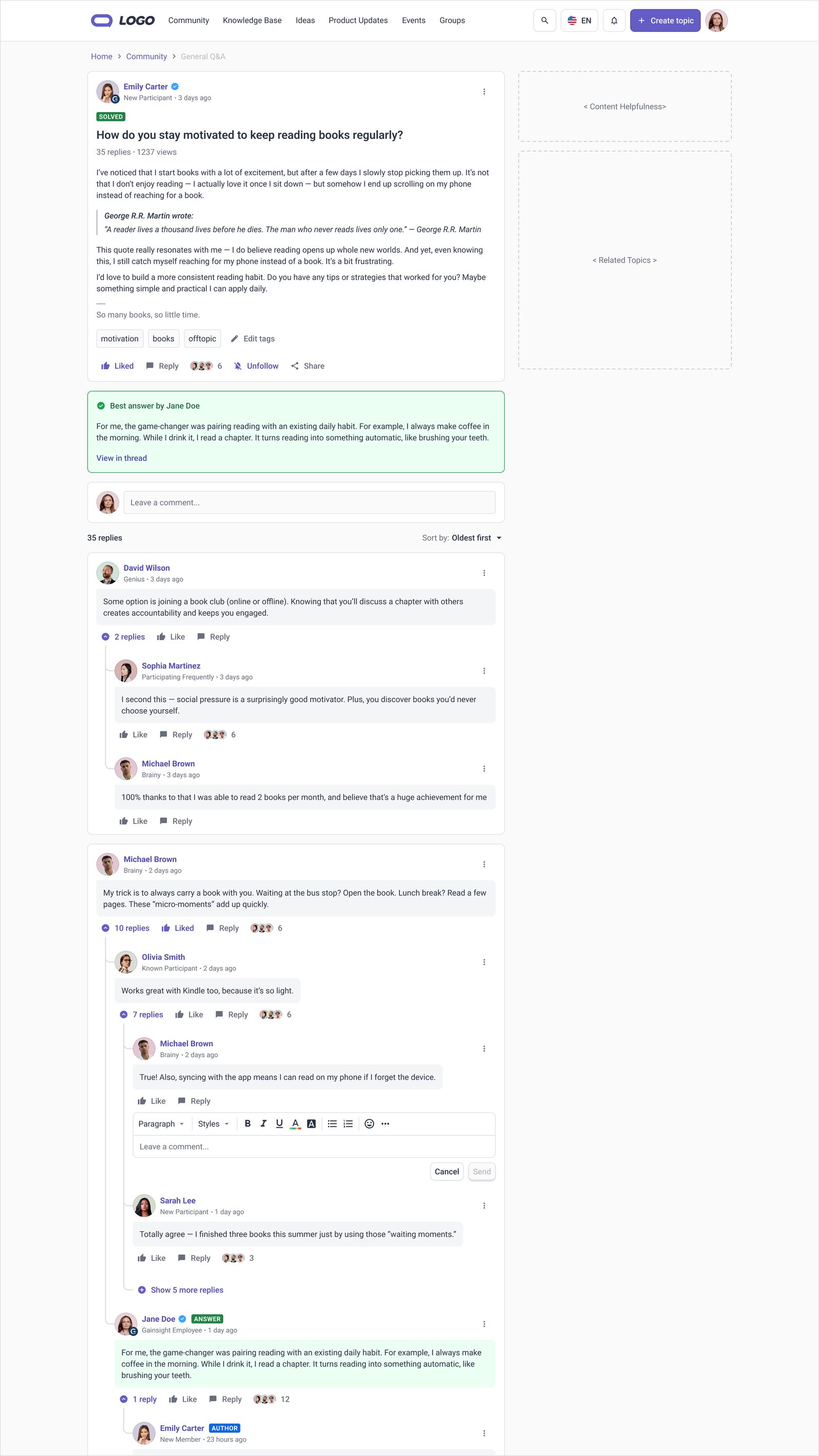
The member-facing product was solid. The admin side had not kept up, and shipping a broken moderator experience would have undermined the whole feature.
Usability testing surfaced one issue: on mobile, users understood how to reply once they found the affordance, but finding it was not intuitive enough. The reply count indicator was too subtle. Two direct fixes: more prominent reply count with a consistent position, and the collapsed state updated to show the replier's avatar.
The larger issue emerged during engineering review. The admin panel had been designed for a flat-post world. Rather than ship a broken moderator experience, we split the admin work: V1 covered essentials, advanced features in a post-launch phase. It delayed nothing.
No launch delay, splitting admin scope into V1 essentials and a post-launch phase resolved the issue before it could block shipping.
Two enterprise accounts had listed threading as a contractual requirement. Shipping this moved them from at-risk to retained.
Thread Replies shipped alongside the V1 admin improvements, giving community managers the ability to view and act on threaded content from the control panel for the first time. Client feedback was strongly positive, particularly from accounts that had flagged threading as a contractual requirement.
The project was cited in my FY26 performance review, which returned an Unmatched Excellence rating, the highest in the organisation.
Two enterprise accounts had listed threading as a contractual requirement. Shipping this moved them from at-risk to retained.
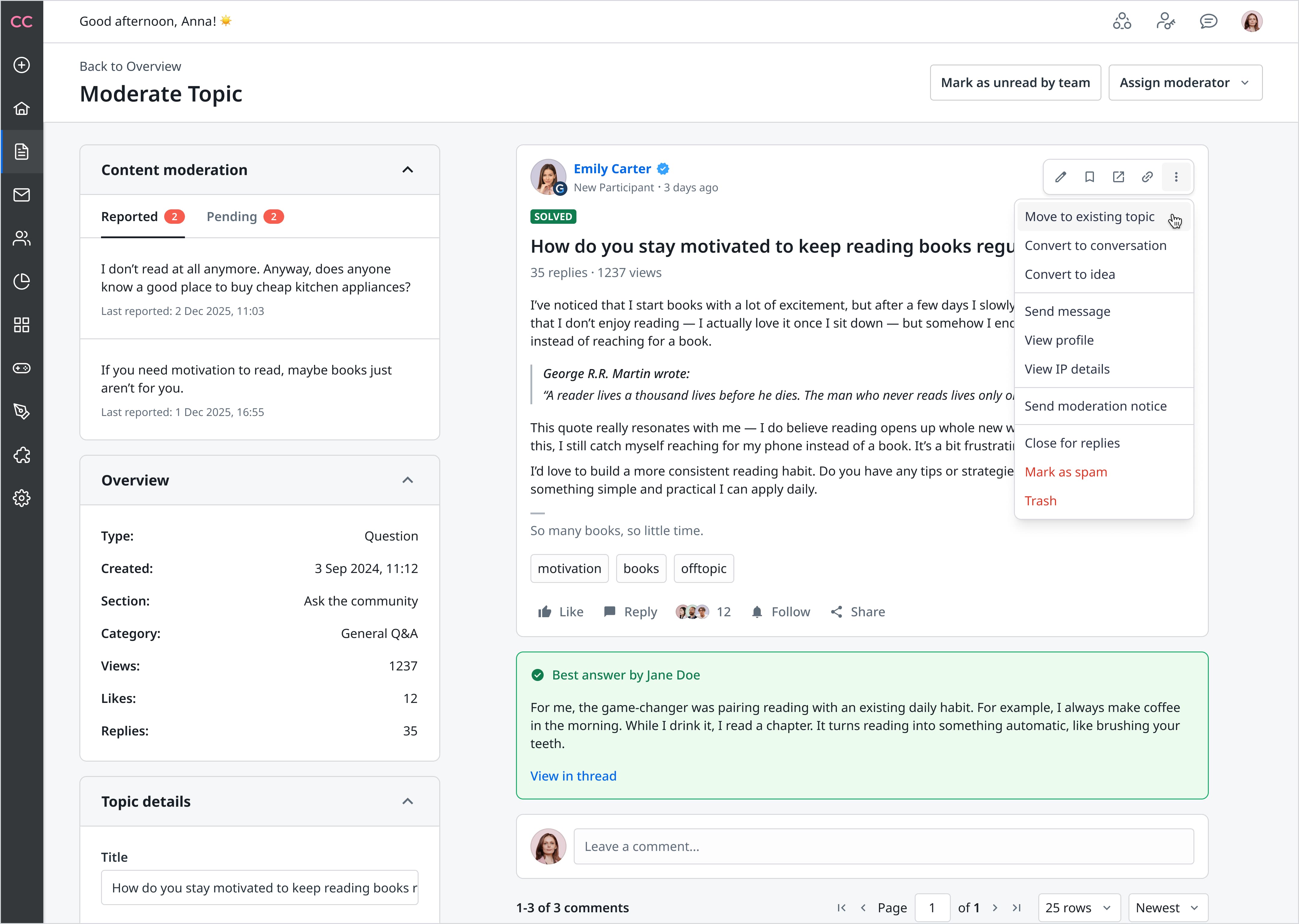
The two-column admin layout came directly from moderation research: small teams, high volume, speed matters more than depth.
Post-launch, I redesigned the admin experience properly. The core challenge: every community-side feature needed a corresponding moderator affordance. The solution was a two-column layout, the right column shows the thread exactly as a member sees it, with an expanded moderator action set. The left column provides topic metadata and a Content Moderation section that surfaces new, reported, and pending content in a single scannable list.
The AI-assisted moderation phase, currently in development, addresses speed. Moderators have to manually review all content, and small teams cannot keep pace with active communities. The AI layer will surface likely policy-violating content proactively before it gets reported.
We had design freedom early that we did not use to align on scope. By the time constraints hit, too much work was too far along to change.
The biggest lesson was scope alignment with engineering early in the process. We had significant design freedom at the start but did not align tightly enough on what was feasible within the implementation timeline. A number of ideas made it far into the design phase before being cut or deferred.
In hindsight: build a clear must-have vs nice-to-have framework earlier, and bring engineering into those conversations before design work gets too advanced.
" Sergi consistently demonstrates strong ownership, craft, and judgment, especially on complex, high-impact initiatives like Threaded Replies. He navigates challenging problem spaces with clarity, grounding his work in research and thoughtful exploration before converging on scalable, user-centered solutions. Throughout delivery, he stays closely aligned with engineering to preserve design intent while adapting pragmatically to constraints. Even post-launch, he continues to refine and improve the experience. The result is a resilient, well-considered design that holds up in real-world conditions. It has been a pleasure working with him.."
Started solo, second designer joined mid-project. Senior PM, Engineering team (FE and BE).
Brand Protection Platform
Corsearch needed to consolidate two competing legacy platforms into a single brand protection product serving IP analysts globally. As the sole designer across 6 engineering teams and 4 product owners, I led end-to-end design of the unified platform, built the design system from scratch, and held the product direction together when product leadership collapsed mid-project.
Read case study →