Employee Expense Management
The first UX-led internal product in my organisation at HP. A mobile expense app replacing a legacy web tool used by 455,000 employees globally. Cut submission time by 58% and saved a projected 204,750 hours annually.
46 minutes to submit an expense report. For a company with 455,000 employees, that is not a usability problem, it is an organisational one.
HP's internal expense management tool had been built to satisfy finance and compliance requirements, not human ones. The result was a process that routinely took 46 minutes per submission, for a task that should take five. Employees avoided it, submitted late, or abandoned claims entirely.
This was the first HP Inc internal product where UX led the process from the start, not retrofitted after engineering had built something. It was a direct test of whether design-led development would produce meaningfully better outcomes than the engineering-led status quo.
Submitters and approvers are not the same user. Treating them as one would have produced a compromise that worked poorly for both.
I structured research around two distinct groups from the start: submitters (employees filing their own expenses) and approvers (managers reviewing their team's submissions). These are fundamentally different jobs, different workflows, different pain points, different definitions of done.
I started with data before talking to users. Google Analytics on the existing tool showed where people dropped off, which steps took longest, and which parts generated the most support tickets. Combined with a heuristic evaluation against Nielsen's 10 principles, I had a clear map of failures before the first interview.
The most-complained-about step: physical receipt scanning via the office printer. This single step accounted for a disproportionate share of the 46-minute average.
Designing mobile-first was not about shrinking the desktop experience. It forced a rethink of the entire interaction model.
The shift to mobile-first was about rethinking when and where expense submission actually happens. Employees submit expenses immediately after the event, on the move, not at a desk later that day. Designing for mobile made the product fit the actual context of use.
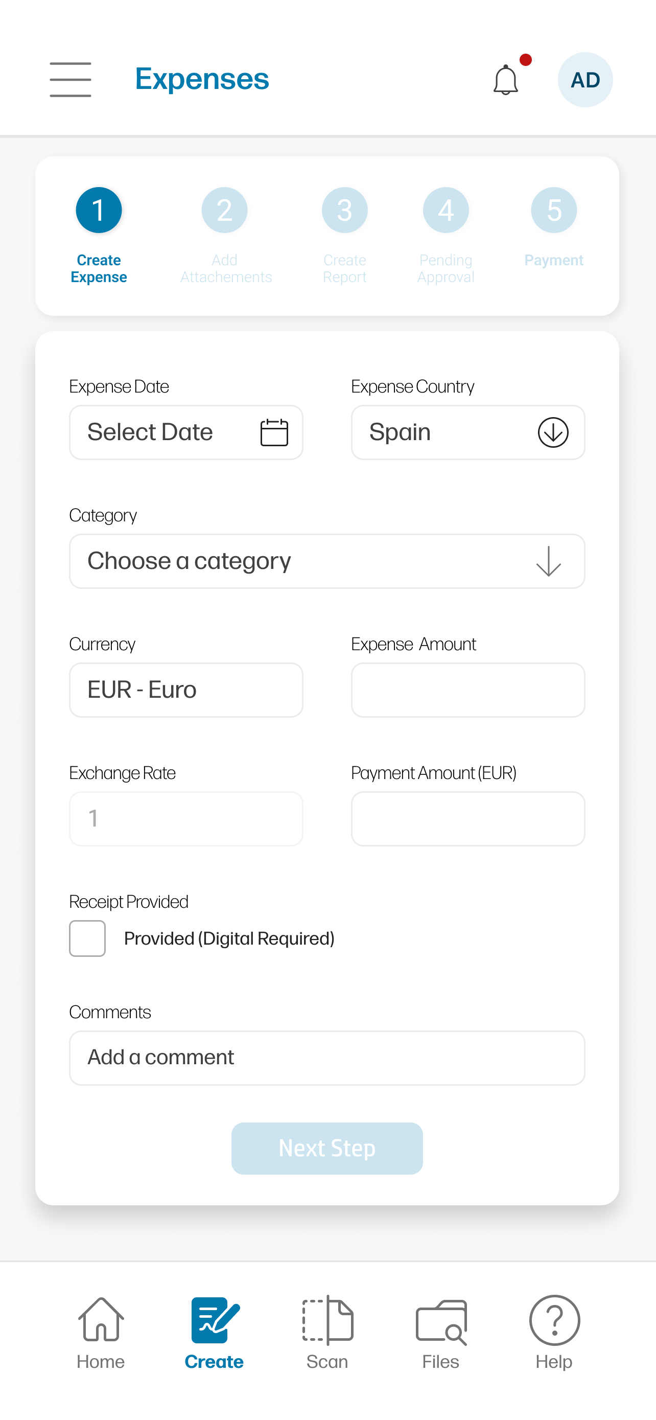
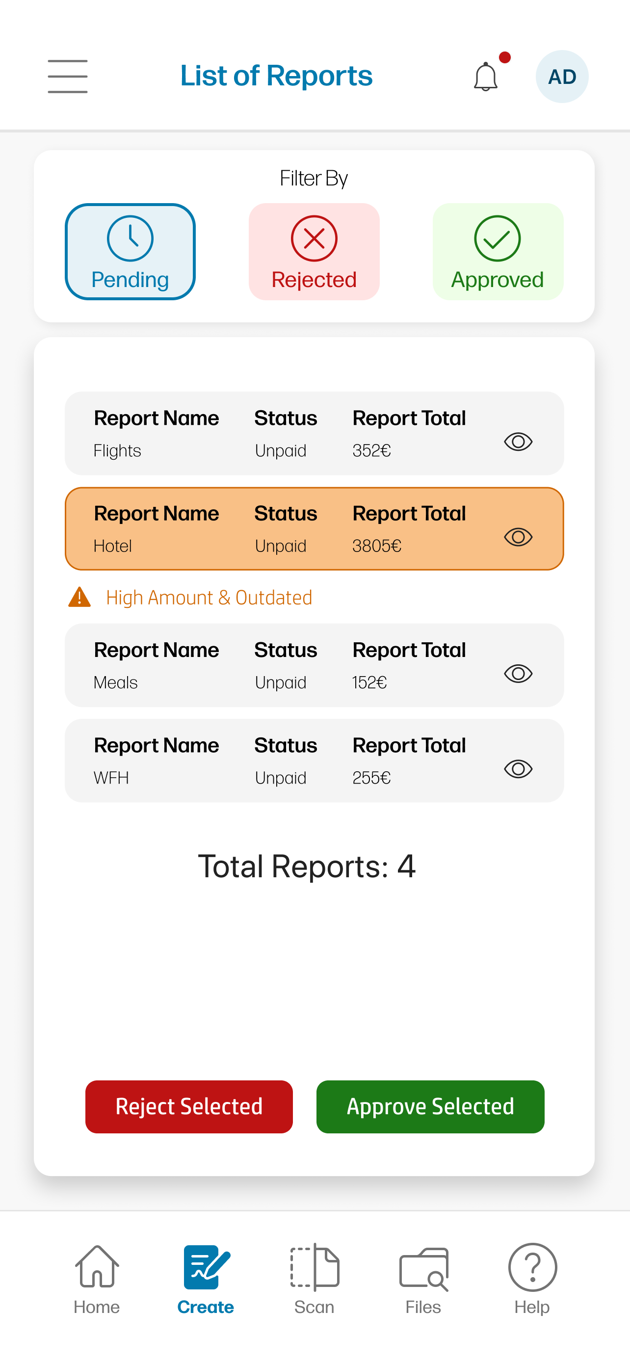
The most impactful single change: replacing printer-based receipt scanning with direct mobile camera capture and automatic receipt parsing. Session persistence meant partially completed submissions were automatically saved as drafts. Submitters and approvers received completely separate interface experiences, same underlying data, completely different interaction models suited to each role.
Mobile submission flow, receipt capture, draft persistence, progressive form
Available on request
HP's own data made the ROI calculation straightforward. 455,000 reports annually. 27 minutes saved each. That is 204,750 hours, every year.
The numbers used HP's own operational data. 455,000 expense reports submitted annually. Old process average: 46 minutes, 348,833 hours total. New app average: 19 minutes, 144,083 hours total. Hours saved annually: 204,750.
Post-launch satisfaction was 4.8/5 across both submitters and approvers. The product also delivered a secondary benefit: approval cycles shortened significantly because approvers now had a clear, structured view of submissions rather than email attachments and scanned PDFs.
Final app, iOS submission view and approver dashboard
Available on request
Design-led process produced outcomes that engineering-led development had not achieved in years of iteration.
The HP project validated something important: when design leads the process from the start rather than being brought in to polish an engineering decision, the outcomes are measurably better. The 58% time reduction did not come from incremental improvement of the existing tool, it came from rethinking the interaction model entirely once the user context was properly understood.
What I would do differently: the approver experience was strong, but the research on approvers was thinner than the research on submitters. In retrospect, I should have run a dedicated research sprint on approval workflows before committing to the approver UI. The feature worked well but was more assumption-led than I would be comfortable with now.
"Sergi's keen eye for detail, creativity, and deep understanding of user-centred design greatly contributed to our project's success. His ability to work collaboratively with cross-functional teams is exemplary."
Product Designer (Sergi, lead), UX Design Lead, Engineering team, Internal stakeholders across Finance and HR.
AI-Powered UI Generation
What started as two people building something nobody asked for is now the standard design-to-code workflow for three platforms at Gainsight. 20+ screens shipped, zero rewrites, and formal sign-off from product, engineering, and UX leadership.
Read case study →